When you click on links to various merchants on this site and make a purchase, this can result in this site earning a commission. Affiliate programs and affiliations include, but are not limited to, the eBay Partner Network.
Photo Vision - Color vs. BW images to convey emotions
I'm going to try something different and do some "Photo Vision" Posts that can be used to hopefully strike up some conversation, questions, critique and overall just so we can all learn a bit. As with anything I post feel free to give feedback and critisim. The only thing I ask is that you follow (2) simple rules. #1) Be respectful - I don't want to hear anyone trashing a client I am working with and #2) Be helpful - If you don't thing and image is good...or if you think it can be better that is great..but say WHY and HOW.
Although I shoot primarily portraiture now, I have always been drawn to Black and White images since my earliest days follow the work of my hero Ansel Adams. I always liked the simplicity to BW images as they can always convey great emotion and get rid of background clutter and keep the view focused on the main subject matter. That said not all images are really black and white they usually have some sort of "tint" to them. With that said pending on how you use the tint it can also further convey some emotions. Cooler colors like having a "Blueish" tint can make a photo more menacing while warmer colors like Yellow tint can be abit more rustic (many of the early photos from the late 1800's in the old west had a "Copper/Sepia" type tint to them).
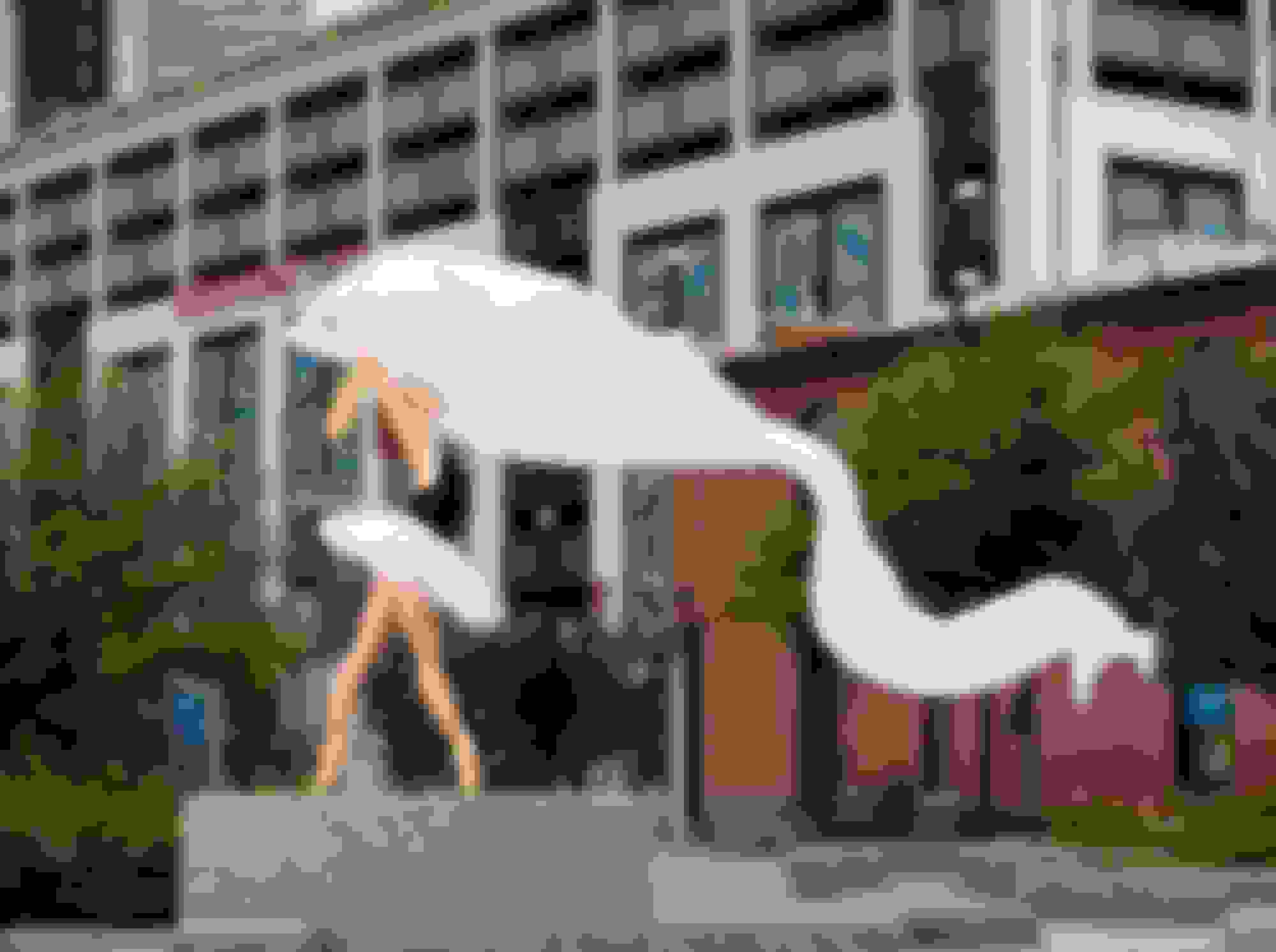
Here a few images I took last week of a Professional Ballet Dancer. The first 2 were taken at Sunset the 3rd one was just after sunset it started to rain and the bottom 2 were taken late morning a few days later. I typically use color photos where there is more movement and/or the subject matter looks to be "happier" for lack of a better word with their facial expression and body language. On the bottom (3) images these were more of an "Urban Dance" vibe and Her expressions and location I shot them to me called for Black and White images. In the third image the rain really came out better in a BW shot vs. color so again I thought it was more effective in that shot. To the point I was making above though regarding Tint...I used (3) different types of conversions on these BW images. The very bottom one I even added some "Scratches and Grain" to give it a little more of an edgy look.
Please comment and/or ask questions, give critique etc...
All shots taken with a Canon 5DIV shot in Manual Mode using (2) light sources (Ambient and 600ws strobe) and 32" Octobox. Lenses used were 24-70 2.8, 70-200 2.8 or 85mm 1.4.
In terms of critique, I think the first image would look a little better if the background was less in focus, like image 2. The detail and color in the background distract my eye from the dancer. With that being said, that color is awesome and the image woukd look really sharp even without the dancer in it. My favorite of the set is image 3, I really like the depth of field, the black and white, and how the rain adds to the image without being a distraction. I think the last three images being black and white adds to the emotion like you mentioned, and I don’t feel as the viewer like I am missing the color at all.
Thank you for taking time to comment. I normally shoot with abit more of a shallow depth of feild though in that particular shot my Dancer wanted the downtown to be clear (she was moving away) and that building "Hearst Tower" is kinda of a known landmark. I shot that at f5, but given the fact I was using a wide angle lens most things near to far will be pretty much in focus given the moderate f-stop.
In photo #2, I actually preferred that one in B&W as well. Though as I mentioned I like putting up photos that vary from my own opinion to see what others notice. Below is that conversion.
I mixed on what my particular favorite is as I like photos for so many different reasons...that said, according to some of the comments I received on my IG account people really love that Image #3 as well.
If anyone would like to know more about how these images are made...or questions...comments in general, please feel free to ask.
Just quickly,......yes, image 3 is really great given the contrast between the structured angular blocks and her human form in a very striking pose.....an unusual pose, especially with the hands. Then the added angle of the slightly out-of-focus rain just adds texture and motion to the whole thing. Nicely done. And, I think way better in B&W than color.
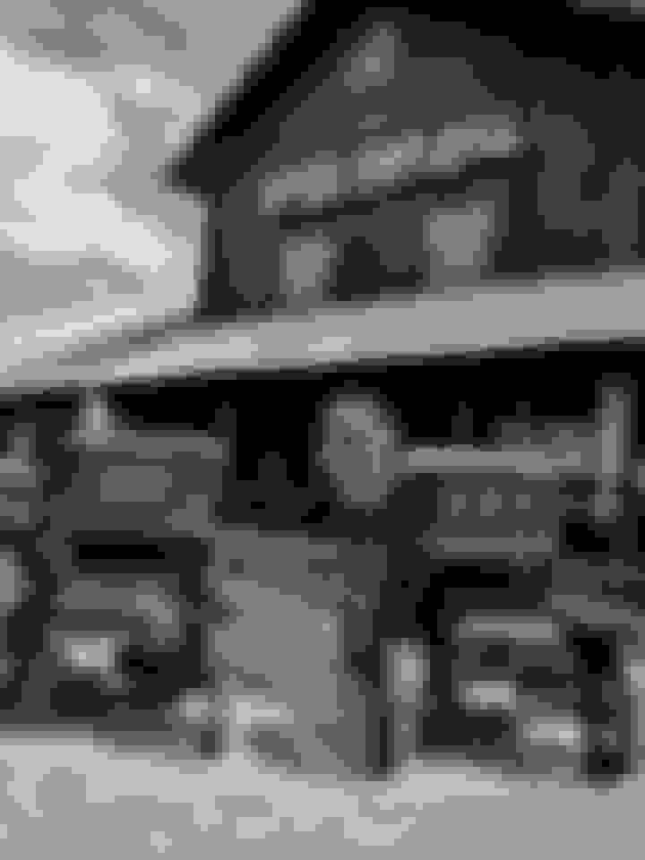
I decided to play around with B&W this past weekend after taking some pictures at Cars and Coffee. While I'm not sure it conveys emotion, I liked it better than the color images of this 911. The files sized are large so I don't believe I can do more than one per post. I converted it to B&W in Lightroom and tweaked it a little bit. Any critique is welcome as are techniques to try out
Last edited by junkyard_dog72; 08-10-2020 at 12:37 PM.
Thanks for putting up some examples. IMO anything "mechanical" or architectural in nature can use abit more punch by (pulling down the blacks, adding some additional contrast, clarity and dehaze). Nothing crazy just giving it abit more edge to the overall image. You can also selectively (with the Brush tool in Light room), drop the exposure down on the left of the image to make the body panel darker (it looks like it supposed to be black but hard to tell in the photo). If so you pull down that exposure the word "Targa" would pop more.
Originally Posted by junkyard_dog72
I decided to play around with B&W this past weekend after taking some pictures at Cars and Coffee. While I'm not sure it conveys emotion, I liked it better than the color images of this 911. The files sized are large so I don't believe I can do more than one per post. I converted it to B&W in Lightroom and tweaked it a little bit. Any critique is welcome as are techniques to try out
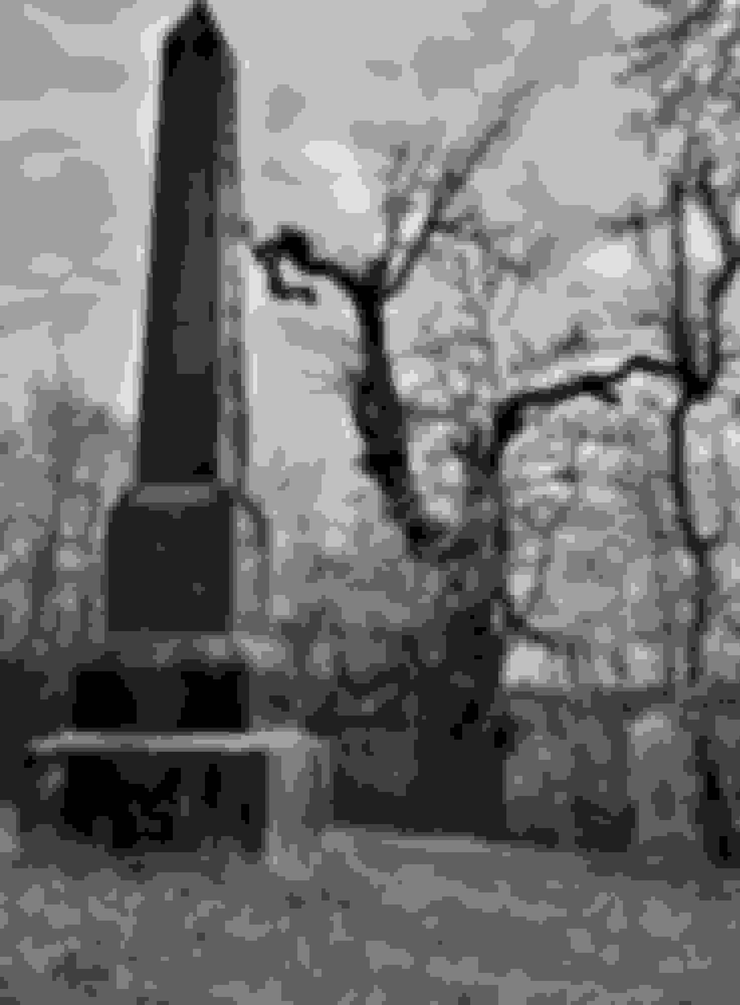
As I said in previous post, I think this is a good representation of the effective use of B&W. A few things to consider to give it a different look.
1) The monument does not appear to be straight (yes I know its an obelisk with converging lines)...though I think it looks to be a little off. General rule in photography is your horizons need to be flat and your lines straight when there are supposed to be. I think about a 2-2 degree rotation clockwise may look a little better.
2) The "Blacks" looked to be crushed...though it may just be the way the forum is rendering the image. If you pull up the blacks and shadows just abit you could see the writing abit better and the texture on the trees. Pending on the program you are using that is "usually" the Orange and Yellow channels. At the same time you can pull down the Blue Channel to compensate and make sure the sky does not wash out.
3) It looks just a tad soft. Could be focus, the lens or again how the forum is rendering the image. IMO (again only my opinion), that BW landscape image should really have some punch to them. If using Lightroom I think a touch of Clarity, Texture, Dehaze and selective Sharpening (select a lower radius) could really make it pop.
Thanks for the input. Played with it a bit but not sure if it's improved. You are very generous with your compliment
I think had I taken time to play with the exposure in the first place, I would have more to work with. This is slightly less "ominous" though as was my intention.
St. Jude Donor '11-'12-'13-'14-'15-'16-'17-'18-'19-'20-'21-'22-'23-'24
I love B&W photography but just don't work enough with it. I really do feel it needs to be special, moody. I don't like conversion for conversions sake, I see a lot of that in landscapes. I think the word "mood" comes into play with portraits, you can really tell a story. I mentioned in another thread that portrait is not my strong suit. Here is a conversion that I think works, your opinions?
I dabble in B&W a little as I find it can result in some stunning pictures. I also find some subjects that I thought would look good in B&W don't and others that I didn't do. It's kind of a weird thing.
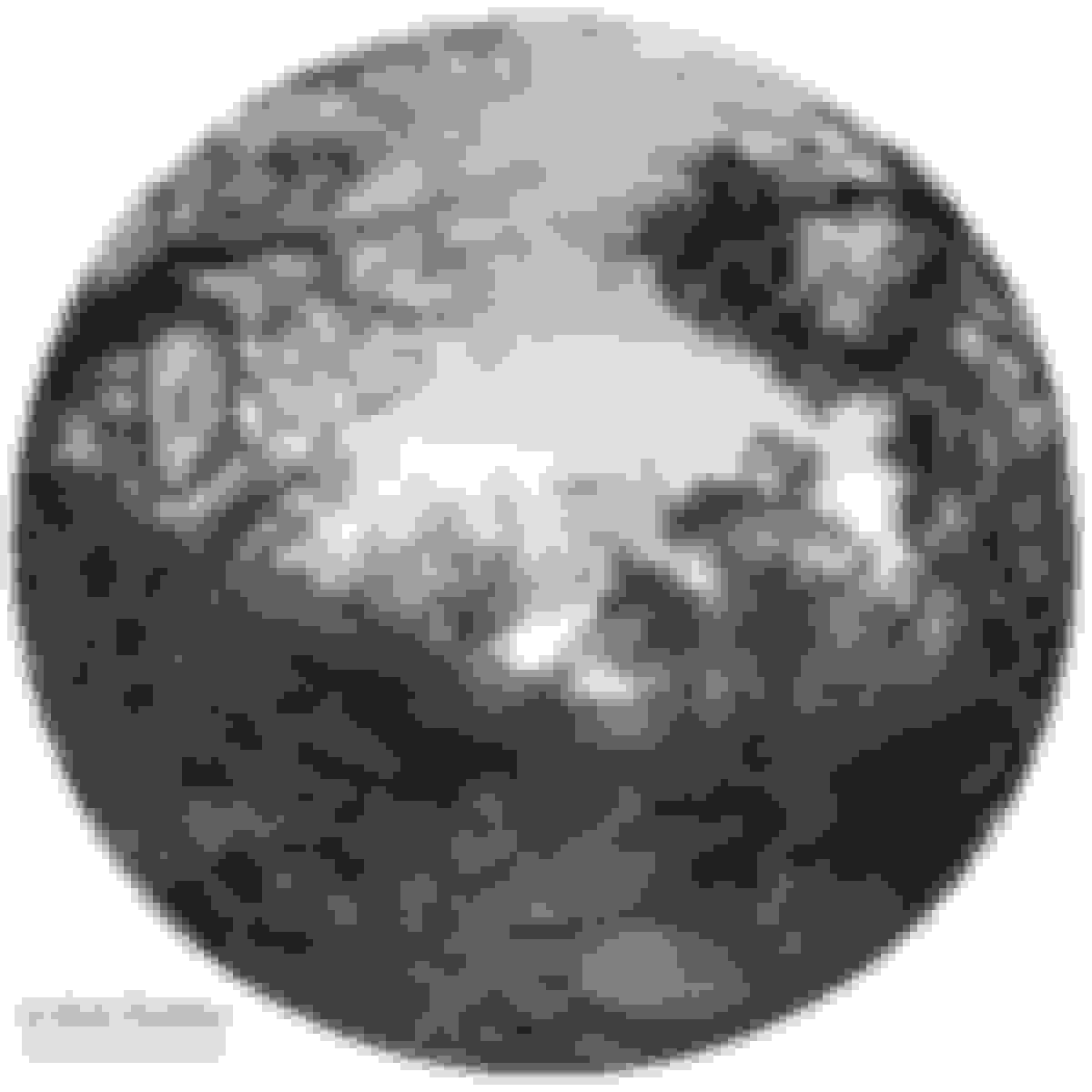
Anyway here is one of my favorite B&W images I've captured. Somehow I was able to blur the foreground and background. I don't know how good that looks to the trained eye but I think it looks good especially the way the ground under the bird is in focus too. Give this shot good texture. B&W just adds to the dramatics IMO.
This was shot with my cell phone so the quality is not that great. The one good thing about my cell phone is it has a dedicated B&W sensor so the B&W comes out a little better than the color sensor trying to simulate B&W. I really like the "glow" around my brother-in-laws face. Pretty cool and an unexpected result.
Ran across this picture and thought it a good candidate to change to B&W. Not really one for conveying an emotion but just to look old. Now if I had the program to make it actually look like an old photo.......dang.
This is a very interesting photo, thanks for sharing. I think B&W works well here IMO and shows some really interesting contrast. I did something (similarish) that I will put up in my next post. My only comment is you might want to play with the green channel and pull down that exposure (or the black levels) just a touch and I think the foreground trees would "pop" even more making them really jump off the page. Nice work
Originally Posted by Win Heger
I love B&W photography but just don't work enough with it. I really do feel it needs to be special, moody. I don't like conversion for conversions sake, I see a lot of that in landscapes. I think the word "mood" comes into play with portraits, you can really tell a story. I mentioned in another thread that portrait is not my strong suit. Here is a conversion that I think works, your opinions?
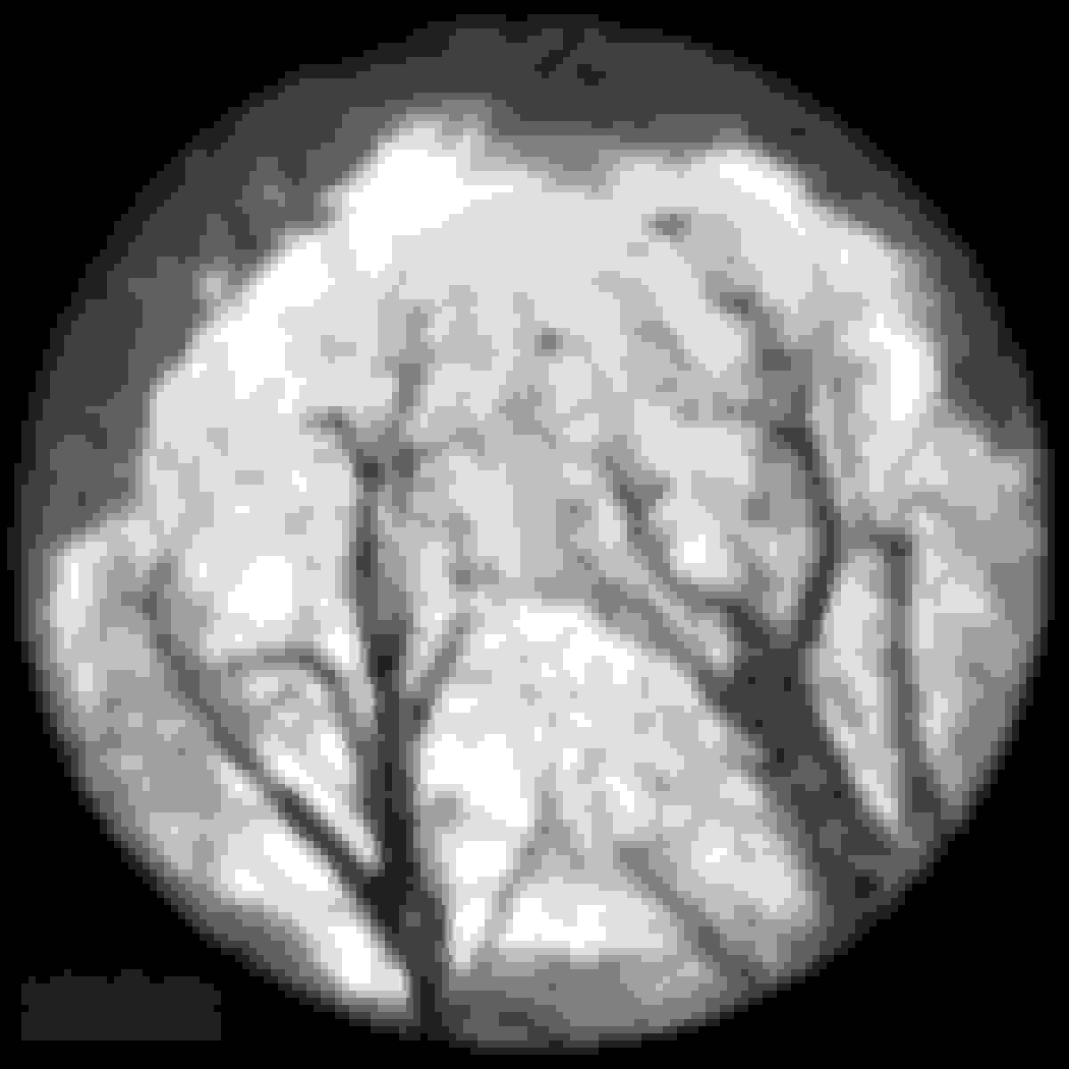
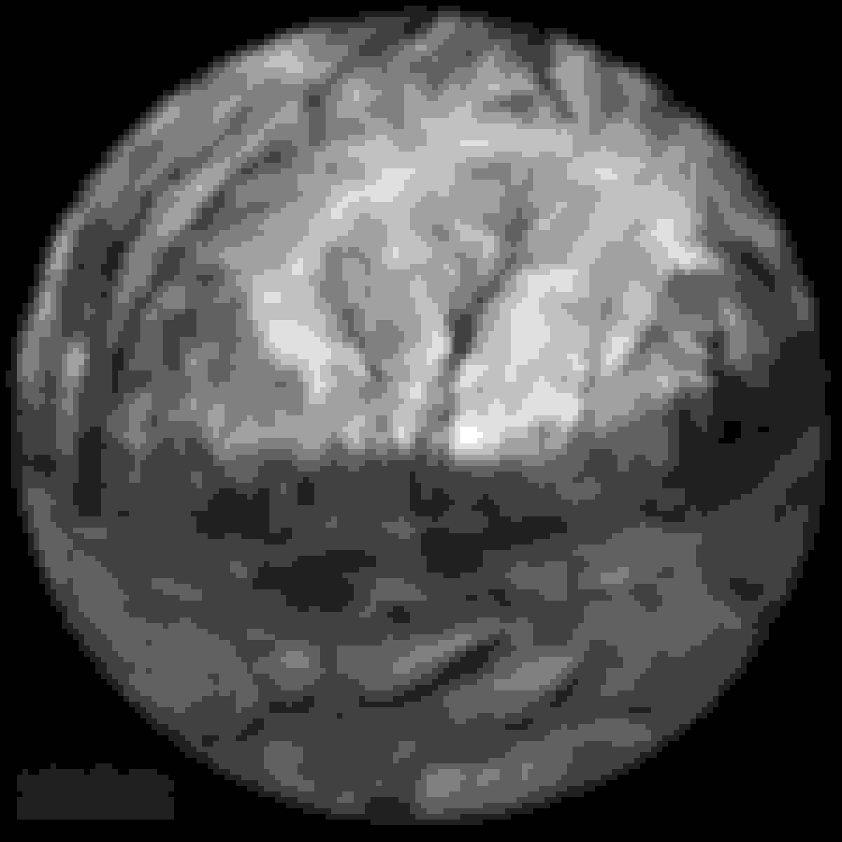
Here are a few Forest Shots I took a few years ago trying out my new 8-16mm Circular Fish-eye lens which give an extremely unique look...don't know how good it is...but they are unique. These were taken at around 6,000 ft. above sea level (one of the highest points east of the Mississippi) so the vegetation is a bit different than what you would see elsewhere. IMO I think the B&W conversion gave the images a very ominous look...almost like a pathway to an old haunted house. At least that is what I was going for.
I've often used a mix of b/w and color in the same photo to draw focal point (I'm no pro by any means...my disclaimer)...it works sometimes (for me), especially when I can't isolate the background with the lens (or lack thereof), or don't have control of the scene in any way.
2011 ALMS...this garage was an explosion of colors, tool boxes, and the Ferrari just didn't punch so...de-saturated what I didn't want to focus on, but yet it still adds to the photo and the scene
Here, there wasn't much color, as the car was Dolphin gray and the colors weren't really profound BUT...there was a bit of blue and green hues I wanted to rid myself of and draw out the BMW logo and the M badge. It somehow just gave the photo more....feel....idk...lol
 08-02-2020, 09:09 PM