
What do you think of these print ads for the C7
 04-21-2013, 10:30 PM
#1
Cruising

Thread Starter

Member Since: Apr 2013
Posts: 11
Likes: 0
Received 0 Likes
on
0 Posts
So these are the magazine ads that we are going to present for our marketing project on Thursday . What do you guys think?
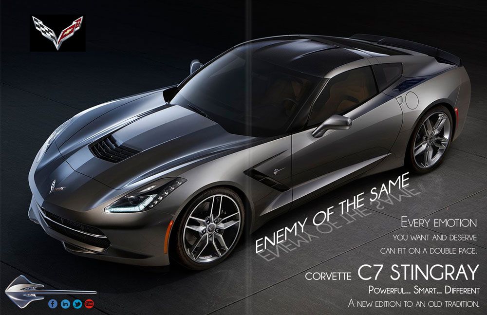
this one is for a two page thread
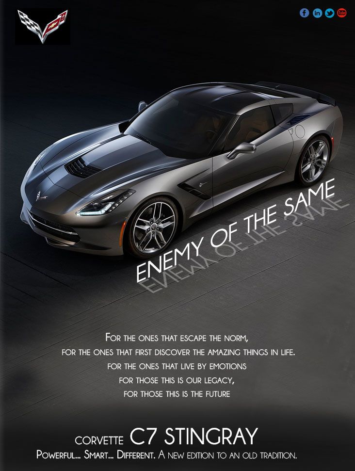
This is for a one page magazine
this one is for a two page thread
This is for a one page magazine
Last edited by Cesar D Cancino; 04-21-2013 at 10:38 PM.
 04-21-2013, 10:43 PM
#2
Moderator


"Every emotion you want a deserve can fit on a double page" ???
I like the "A new edition to an old tradition" line.
I like the "A new edition to an old tradition" line.
04-21-2013, 11:26 PM
#4

Very good!
I like the "Enemy of the same" part. For the rest, if I could offer a suggestion, I would have only 1 line other than Corvette Stingray... "A new edition to an old tradition". Enough said
I like the "Enemy of the same" part. For the rest, if I could offer a suggestion, I would have only 1 line other than Corvette Stingray... "A new edition to an old tradition". Enough said
04-21-2013, 11:30 PM
#5
Trying too hard. Too busy/wordy. Hate the font. Pic is OK. General layout is OK. I'd prefer the C7 Corvette logo larger and faded into the background behind the car. I do like the text reflected in the floor.
IMO, a pic of the car in motion would better follow the text. Maybe with an inset pic of the interior.
I'd lose the Stingray logo on the spread.
I'm not a fan of the tag line. "A new edition to an old tradition" is poetic, but not the approach I would take. Saying it is "old" in any way, shape, or form isn't helpful.
Good luck with your presentation!


 04-22-2013, 02:31 AM
#9
Le Mans Master

Member Since: Apr 2013
Posts: 6,657
Received 4,116 Likes
on
1,470 Posts
2020 C8 of the Year Finalist - Unmodified

The enemy of the same needs to talk to the guy who wrote this copy.
04-22-2013, 02:51 AM
#10

Interesting.
Font looks a little Art-Deco, doesn't quite match the car, except for maybe the modern-classic type of overall theme.
Not a fan of the reflections on the floor.
Maybe instead of "New Edition of an Old Tradition", could be "New Edition of a Classic Tradition"
Maybe too many words as well.
Thanks for sharing.
-T
04-22-2013, 03:29 AM
#11
Le Mans Master
Don't use all-caps or small-caps for body copy. Make the body copy smaller, about the size of normal magazine body text, so that people don't try to read it like a series of bullet points (or a poem).
Were you required to use "enemy of the same?" Because it's weak to begin with, and you don't really leverage it in your copy.
Also, "a new edition to an old tradition" is making my grammar muscle twitch. It's "new edition of" or "new addition to." Also, the main tagline "enemy of the same" doesn't really leave room for the word "tradition" -- they're at odds, unless you somehow communicate that Corvette's tradition is the enemy of the same.
Marketing Corvette is hard. I'm not sure GM knows how to do it with words, except with the old standbys of power and technology, mostly via specs.
04-22-2013, 07:21 AM
#12
Race Director

Great first effort!
I agree too many words...too many emblems and I don't care for the tag line ENEMY OF THE SAME..
Negative connotation is a concern.
New possible tag line.."
New edition of the Great American Icon
I agree too many words...too many emblems and I don't care for the tag line ENEMY OF THE SAME..
Negative connotation is a concern.
New possible tag line.."
New edition of the Great American Icon
04-22-2013, 07:32 AM
#13
who are you and who/what do you represent?
really don't like the "enemy angle"
seems GM should be trying to make friends for sales
really don't like the "enemy angle"
seems GM should be trying to make friends for sales
04-22-2013, 08:53 AM
#15
Melting Slicks

What happened to Chevy's new tag line " Find New Roads"?
agree too wordy.
agree too wordy.
04-22-2013, 09:10 AM
#16
Burning Brakes

 Most people wouldn't know what C7 is in the real world. Other then that, it's a good starting point, but to many words like others have said....
04-22-2013, 09:26 AM
Most people wouldn't know what C7 is in the real world. Other then that, it's a good starting point, but to many words like others have said....
04-22-2013, 09:26 AM
#17
Le Mans Master
I've seen much more flattering pics of the car and as for the rest of it, I'll just say that my mother taught me that if you don't have anything nice to say......

 04-22-2013, 01:35 PM
#20
"2014 Corvette - It's everything I never knew I wanted in a car"